Tectonic Shifts in Orange County

Orange County has evolved from a Republican stronghold to a credible target of opportunity for the Democrats seeking to take control of the U.S. House of Representatives in the November election.

Until the most recent presidential election, Republican candidates had won in every top-of-the-ticket statewide race in Orange County for 20 years. In fact, the last time that a Democratic presidential candidate carried Orange County was in 1936. But in 2016, Democrat Hillary Clinton defeated Republican Donald Trump by 51 to 42 percent, a margin of 102,813 votes. Moreover, Clinton received more votes than Trump in each of the four Orange County House seats now held by Republicans.

Tectonic shifts in Orange County’s demographics and voter registration set the stage for the surprising 2016 presidential outcome and the competitive 2018 House races. First, Orange County’s population is transitioning. Since 2000, the proportion of whites has declined from 51 percent to 41 percent of the population. Latinos now make up to 34 percent and Asian Americans make up 21 percent of the population. Most Latino and Asian American likely voters are registered Democrats today.

Second, Orange County’s political stripes have changed from red to purple. Since 2000, the proportion of registered Republican voters has declined from 49 percent to 36 percent. Registered Democrats have increased to 34 percent and independents have increased to 27 percent. Today, most independent likely voters lean toward the Democratic Party. In sum, Republicans’ electoral clout is diminishing in Orange County.

Since this midterm election is a referendum on the president, how is Donald Trump viewed by Orange County voters? The Public Policy Institute of California’s Statewide Survey has been tracking President Trump’s popularity by asking the following question, “Overall, do you approve or disapprove of the way that Donald Trump is handling his job as president of the United States?” In five 2018 PPIC surveys, 40 percent approve and 56 percent disapprove of President Trump when combining the results for registered voters in Orange County.

Approval of Trump’s presidency in Orange County varies widely by party: 79 percent of Republicans, 30 percent of independents, and 13 percent of Democrats. Half of whites approve of his performance, while 28 percent of nonwhites approve. Overall, Trump’s approval rating in Orange County of 40 percent in 2018 closely mirrors his 2016 vote total, which was 42 percent. This indicates his political base in Orange County has not grown during his time in office.

Voter turnout will be the political wildcard in Orange County. Since 2000, Orange County’s voter turnout in midterms has been on average 21 points lower than in presidential elections. Low turnout this year would be a throwback to the “old” Orange County electorate—more Republicans and whites. A high turnout would reflect the “new” Orange County—more Democrats, independents, and nonwhites.

We’ll know in a month whether the new or old Orange County will prevail in 2018. But given the demographic and registration trends, the Orange County of the future will be very different from the one that consistently voted for Republicans.

College Rankings and Social Mobility

As high school seniors decide where to apply, numerous websites, magazines, and organizations are releasing lists of the “best colleges.” These rankings try to evaluate a college’s quality or highlight a particular factor, such as best value. Most rankings use similar data sources and variables, but each weighs factors differently in order to define and evaluate quality. Popular categories include student outcomes (graduation rate, earnings after college), measures of institutional quality (faculty quality, monetary value of resources for students), and affordability (net cost, institutional aid). Improving a college’s rank generally involves doing better in one or more of those areas relative to other institutions.

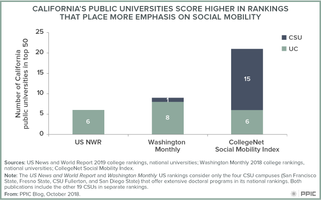
Recently, many rankings have started to consider social mobility—a school’s ability to move students up the ladder of economic opportunity. But the importance of social mobility in overall rankings varies widely. Just this year, US News World Reporta longtime leader in college rankings—removed acceptance rates from its methodology and instead factored in graduation rates for students who receive Pell Grants (these students are from the lowest-income families in the nation). Even so, the US News and World Report rankings do not give much weight to that measure. In contrast, Washington Monthly, another well publicized ranking, bases one third of its ranking scores on social mobility, including new data on graduation rate gaps between students who receive Pell Grants and those who do not. At the other end of the spectrum, the relatively new CollegeNet Social Mobility Index (established in 2014) focuses exclusively on elements of social mobility.

Research by the Equality of Opportunity Project shows that California’s public colleges do relatively well in promoting social mobility, particularly in moving students from the lowest to the highest quartile of income. The figure below shows the number of California’s public universities the top 50 according to each of three rankings; the greater the importance of social mobility, the higher California public universities rank relative to both private and public schools in other states.

Colleges pay attention to rankings, and highly rated schools publicize their ranks and use them in recruitment literature. A closer link between higher rankings and improved social mobility can be a win for California, its colleges, and its students.

2020 Census: Counting Los Angeles County

The decennial census plays an essential role in American democracy. Our series of blog posts examines what’s at stake for California and the challenges facing the 2020 Census, including communities that are at risk of being undercounted.

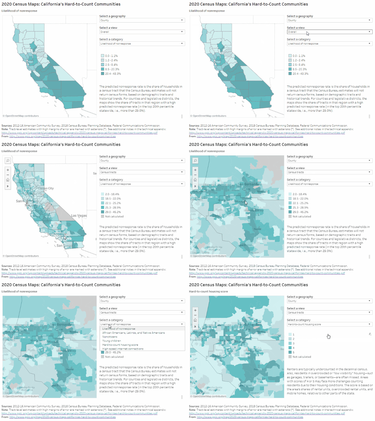
PPIC’s interactive census maps are an important tool for Californians working to ensure an accurate census count. Using estimates from the Census Bureau and the Federal Communications Commission, they highlight hard-to-count communities across the state and pinpoint reasons why certain areas may be hard to reach.

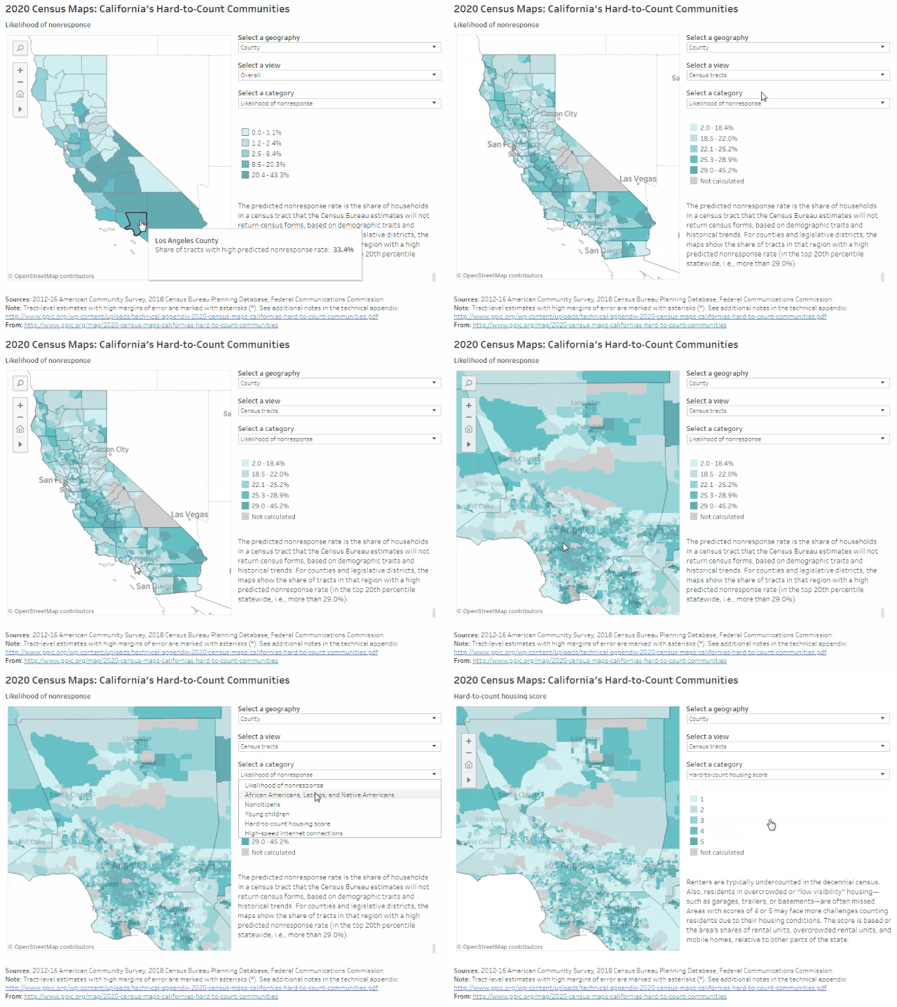
Home to about a fourth of the state’s population (10.3 million people), Los Angeles County may be one of California’s hardest-to-count regions in 2020. A third of the county’s census tracts are likely to be very hard to count, according to Census Bureau estimates that draw on local demographic characteristics (e.g., race/ethnicity, age, citizenship, and housing conditions) and historical trends. These areas tend to be concentrated in central and east LA south through Compton, as well as parts of Long Beach, the San Fernando and San Gabriel Valleys, Pomona, and Palmdale. Households in these very hard-to-count areas are less likely to respond initially to census forms and are therefore at risk of being undercounted.

Some highlights:

  • An undercount could reshape political representation in the region. Disproportionately undercounting parts of LA County could affect how district lines are redrawn after the census. Legislative districts in central and south LA have some of the highest concentrations of very hard-to-count communities in the state: In State Assembly District 59 (Jones-Sawyer), 96% of census tracts are considered very hard to count. In ten more legislative districts representing parts of central and south LA, over half of neighborhoods are considered very hard to count.
  • Undercounting people of color would dramatically misrepresent LA County’s urban core. About 57% of LA County residents are African American, Latino, or Native American—populations that have historically been undercounted in the census. In most central, south, and east LA neighborhoods, for example, African Americans and Latinos make up 80% to 100% of residents, compared with less than 15% in parts of nearby Beverly Hills and San Marino. If the 2020 Census again undercounts these groups, political representation could shift away from LA’s urban centers.
  • LA County’s hard-to-count housing is concentrated in communities of color. It can be difficult for the Census Bureau to accurately count people in rentals, overcrowded units, and mobile homes. Housing in LA County is among the hardest to count in the state. Moreover, in many neighborhoods with the hardest-to-count housing, nearly all residents are African American and/or Latino. Recognizing ways that hard-to-count communities intersect with each other will be important to conducting effective outreach to LA residents. In addition, reaching homeless Angelenos during the three-day window for counting people at shelters, tent camps, and other places will be critical to a complete and accurate count in the region.
  • Neighborhoods throughout the county have high shares of young children. In particular, east and south LA, as well as Lancaster and Palmdale, have larger concentrations of young children—who are typically undercounted in the census. In many of these neighborhoods, children under five years old make up more than 10% of residents, compared to less than 7% statewide.
  • Low responses from noncitizens would lead to a notable undercount in the region. Noncitizens may be less likely to respond to the 2020 Census due to the planned addition of a citizenship question and concerns about deportation and privacy. About 17% of LA County residents are noncitizens, compared to 14% statewide. In several neighborhoods in central and south LA, east LA, the San Fernando and San Gabriel Valleys, and Pomona, more than a quarter of residents are noncitizens.
  • The county has pockets of low internet access, including in the city of LA. The Census Bureau plans to collect the majority of responses online in 2020—a change from previous practice. Though urban areas generally have better internet access than rural areas do, a number of neighborhoods in central and south LA actually have fewer high-speed residential internet connections than the surrounding suburbs. The northeastern corner of the county also has lower levels of internet access. In these places, it may be harder to collect responses online, and participation will rely more heavily on in-person census takers or internet provided by local institutions.

We hope these maps serve as a starting point to help local, regional, and state leaders think about which activities, resources, and partnerships—including language assistance, awareness raising, and community outreach—might be most effective for accurately counting different parts of California. Stay tuned for more posts that examine hard-to-count communities in other regions of the state.

Video: Californians and Their Government

As the November election approaches, Democrat Gavin Newsom has a 12 point lead over Republican John Cox in the race for governor. In the US Senate race, Dianne Feinstein leads fellow Democrat Kevin de León by 11 points. Half of likely voters see this election as more important than past midterms; most lean toward Democratic candidates in US House races. These and other key findings in the latest PPIC Statewide Survey were outlined by PPIC researcher Dean Bonner at a Sacramento briefing last week.

A slim majority of California’s likely voters oppose Proposition 6, a ballot measure that would repeal recently enacted increases in the gas tax and vehicle registration fees. Proposition 10—which would expand the authority of local governments to enact rent control—is also trailing.

Other survey highlights:

  • Three in four likely voters view the choice of the next Supreme Court justice as very important to them personally.
  • Majorities of registered voters across parties say they do not want to see the Supreme Court’s Roe v. Wade decision completely overturned.
  • A third of likely voters approve of President Trump’s job performance and only 20% approve of Congress; by contrast, more than half approve of Governor Brown and the state legislature has a 44% approval rating.
  • Likely voters are most likely to name jobs and the economy, immigration, and housing as the most important issues facing the state.

Groundwater and the Colorado River

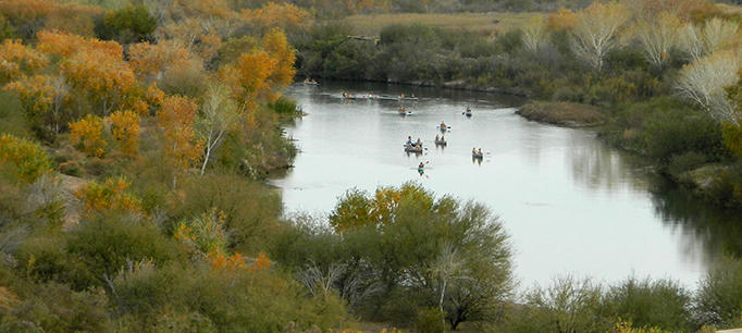
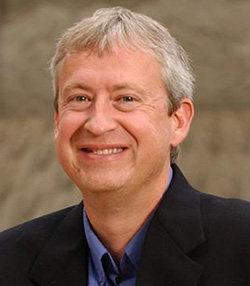
Like so many rivers, the Colorado is closely linked to groundwater. A US Geological Survey study found that more than half of the streamflow in the upper Colorado Basin originates as groundwater.  We talked to Doug Kenney—director of the Western Water Policy Program at the University of Colorado and a member of the PPIC Water Policy Center research network―about managing groundwater in the basin. Kenney organized a conference in June that covered these issues in depth.

PPIC: What is the status of the basin’s groundwater?
Doug Kenney: That’s difficult to answer, in part because there’s a lack of good information on groundwater in many areas. Also, there is no one groundwater source—the Colorado Basin has multiple aquifers, with different types of connections to surface waters and different uses for the water. Some aquifers provide potable water, while others are too salty or polluted to use for drinking. We have a number of huge aquifers, and some very tiny ones.

Some places have a very tight physical connection between groundwater and rivers. In those areas, if you drill a lot of wells and the water table drops, streams can dry up. The connection goes the other way as well—when there’s a lot of water flowing in streams, some seeps into aquifers. In other places, there may not be a physical connection but groundwater use impacts overall water management. The key is that if you manage groundwater poorly, surface water will ultimately suffer―and vice versa.

PPIC: What are the big challenges for managing groundwater in the basin?

DK: While it’s hard to generalize, the trend is increased pressure on groundwater, just as with the basin’s surface water. In some aquifers, depletion is a really acute problem. The management challenge is that with so many differing circumstances, you need a unique approach for each one. Each state in the basin has come up with its own groundwater laws and policies, but each state also recognizes that managing groundwater at the state level is too broad―you still need solutions tailored to local conditions.

Managing groundwater is just inherently difficult—you can’t see it and it’s hard to measure. And there’s a time lag: bad groundwater management today often creates slow-moving problems that might not be felt for many years. In those cases, there’s no constituency to protest groundwater mismanagement because those constituents haven’t been born yet. With surface water, if someone is using water in a way that harms another user, that user will draw attention to the problem.

The Colorado River is governed by a compact between states, and there’s a body of law to help manage its surface waters. But the river’s compact doesn’t deal with groundwater, and it’s always been left out of the discussion. You can get away with that for a while, but once it affects surface-water allocations, that’s where agreements start to fall apart—as has happened on the Rio Grande, the Arkansas, and the Republican Rivers. These are just three examples where the Supreme Court had to get involved. I worry that’s going to be the future for the Colorado too.

PPIC: What strategies hold promise for improving groundwater management in the future?

DK: I’d say 80% of good groundwater management is just making the effort. It will always be a difficult endeavor, but you have to try.

In many respects, groundwater management has become more innovative than for surface water. For example, there are more experiments with market-based approaches in groundwater. In places as diverse as the Diamond Valley in Nevada and in the San Luis Valley in Colorado, new incentive structures are being tried to reward people for not depleting the aquifer. In both places, prospects for maintaining the agricultural economy are much better than before; people have had to innovate or die. In surface water, it’s more about clarifying who has what rights to water and enforcing them—there’s not as much innovation. But in groundwater people are trying creative things and it’s encouraging.

California Community Colleges Are Transforming Developmental Education

With the passage of AB 705 in October 2017, California community colleges are in the midst of a major transformation of developmental education. The new law requires that community colleges restructure developmental education to maximize the likelihood that students will enter and complete transfer-level coursework in English and mathematics/quantitative reasoning in a one-year time frame.

Full implementation of AB 705 is expected no later than fall 2019. As colleges replace standardized test scores with high school records as their primary placement criteria, it is likely that the majority of entering students will enroll in transfer-level courses. To improve the likelihood of success, especially among students with the lowest high school performance levels, colleges are being encouraged to implement curricular reforms as well. Co-requisite remediation is an essential component of these reforms: it allows students who would otherwise be deemed underprepared to enroll directly in transfer-level math or English courses with concurrent remedial support.

While the vast majority of the state’s 114 community colleges have not yet implemented co-requisite models, a few colleges began experimenting with co-requisites and other reforms before the passage of AB 705. According to a recent PPIC report that looks at the efforts of these “early implementers,” co-requisites in English are more common than those in math. Nine California community colleges provided co-requisite courses in English to about 3,000 students in 2016–17 (the latest year of available data), and at least seven additional colleges began offering English co-requisite models in 2017–18.

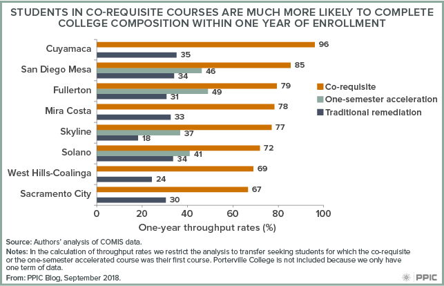
Early implementer colleges have seen dramatic gains in the completion of transfer-level English courses. Results for the fall 2016 cohort show that 78% of all co-requisite students completed a college composition course within a year; this metric, known as throughput rate, will be used to measure success under AB 705. The throughput rate of co-requisite students is 50 percentage points higher than the throughput rate of students who started in traditional remedial courses (27%); it is 36 percentage points higher than the throughput rate of students who took one-term accelerated developmental English courses (42%), and similar to the throughput rate of students who enrolled in transfer-level English without co-requisite support.

Throughput rates ranged from 67% to 96% across this group of colleges; rigorous research is needed to understand which factors are driving this variation. However, this early evidence—while not causal—does shed light on what we can expect to see in terms of student outcomes as more colleges move toward compliance with AB 705 requirements.

2020 Census: Counting the Bay Area

The decennial census plays an essential role in American democracy. Our series of blog posts examines what’s at stake for California and the challenges facing the 2020 Census, including communities that are at risk of being undercounted.  

PPIC’s interactive census maps are an important tool for Californians working to ensure an accurate census count. Using estimates from the Census Bureau and the Federal Communications Commission, they highlight hard-to-count communities across the state and pinpoint reasons why certain areas may be hard to reach.

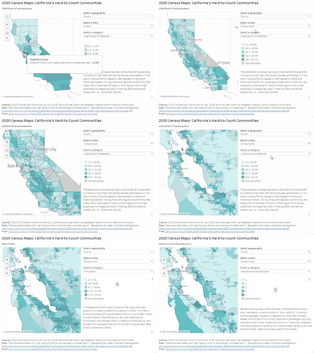
Home to about 20% of the state’s population—some 8 million people—the Bay Area has clusters of hard-to-reach places throughout the region. Of the 10 counties bordering the San Francisco, San Pablo, and Suisun Bays, including neighboring Santa Cruz County, Alameda has the highest share of very hard-to-count areas (14% of census tracts) and Napa the lowest (3%). Households in these very hard-to-count areas are less likely to respond initially to census forms and are therefore at risk of being undercounted, according to Census Bureau estimates that draw on historical trends and local demographic characteristics (e.g., race/ethnicity, age, citizenship, and housing conditions). Compared to some of California’s central and southern counties, the Bay Area has lower shares of very hard-to-count places, but there are still several areas of concern.

Some highlights:

  • East Bay legislative districts have the highest concentrations of very hard-to-count neighborhoods in the region. In three East Bay legislative districts, 20% or more of census tracts are considered very hard to count: Congressional District 13 (Lee), State Senate District 9 (Skinner), and State Assembly District 18 (Bonta). Each of these districts represents Oakland and other parts of the East Bay.
  • But there are hard-to-reach neighborhoods throughout the Bay Area. In addition to Oakland, residents in the East Bay cities of Richmond, Berkeley, and Hayward are likely to be hard to reach, with around 30% of households in many neighborhoods predicted not to respond initially to the census. In San Francisco, particularly hard-to-reach neighborhoods include SoMa, the Mission District, and Bayview/Hunters Point. Other cities with many hard-to-count census tracts include Santa Cruz, San Jose, East Palo Alto, and Redwood City on the Peninsula, and Antioch, Santa Rosa, and Vallejo in the North Bay. It is important to keep in mind that communities may be hard to count for multiple reasons.
  • Understanding local population trends can help guide effective outreach. Compared to the rest of the state, Bay Area counties tend to have lower-than-average shares of young children, African Americans, Latinos, and Native Americans—populations that are typically undercounted in the census. Nevertheless, many neighborhoods have relatively high concentrations of young children and people of color—and are still at risk of being undercounted. For example, undercounting people of color in 2020 could significantly misrepresent communities in Richmond, Oakland, East Palo Alto, and Bayview/Hunters Point.
  • Low responses from noncitizens could lead to an undercount, especially in the South Bay.
    Noncitizens may be less likely to respond to the 2020 Census due to the planned addition of a citizenship question and concerns about deportation and privacy. Nearly 18% of people in Santa Clara County are noncitizens, compared to just under 14% statewide. Noncitizens make up about 15% of residents in Alameda and San Mateo Counties as well. In many neighborhoods—including parts of Fremont, Sunnyvale, Cupertino, and Redwood City—more than 30% of residents are noncitizens.
  • Housing conditions may make some Bay Area residents particularly hard to reach. Several neighborhoods in the East Bay, San Jose, Redwood City, and Santa Cruz have relatively large shares of housing units that are rentals, overcrowded rentals, and/or mobile homes—a reflection of how residents are coping with some of the most expensive housing markets in the country. These conditions can make it harder for the Census Bureau to find and count residents. In some parts of San Jose, for example, one in four rentals is overcrowded. Reaching homeless residents during the three-day window for counting people at shelters, tent camps, and other places will also be critical to an accurate count in the region.

We hope these maps serve as a starting point to help local, regional, and state leaders think about which activities, resources, and partnerships—including language assistance, awareness raising, and community outreach—might be most effective for accurately counting different parts of California. Stay tuned for more posts that examine hard-to-count communities in other regions of the state.


Improving Special Education in California

What are the most significant challenges in California’s K–12 school system today? A new report, Getting Down to Facts II, recently released comprehensive findings. PPIC was asked to weigh in on the topic of special education.

We contributed an update to our 2016 report, Special Education Finance in California. This report concluded that state funding for services to students with disabilities is inequitable, inadequate, and lacks transparency. It also fails to provide the same level of local control as other state funding programs. In addition, preschool services to infants and toddlers with disabilities are lacking.

Our new report, Revisiting Finance and Governance Issues in Special Education, expands the analysis of these issues. Overall, we suggest that weaving greater accountability into governance and finance of special education has the potential to improve equity for students with special needs.

Specifically, we find:

  • The state has several good options for revising the special education funding formula so that it better reflects district costs. However, we find that basing funding on the number of disabled students in each district could create negative incentives for districts.
  • Better funding for services to infants and toddlers with disabilities would encourage districts to increase the number of children receiving early services, which would improve behavioral and cognitive skills in some children.
  • Current accountability measures for student success do not acknowledge the unique program factors that can affect district performance data. We find the growth of individual student outcomes is a better measure of progress than the average group scores for all students with disabilities.

We also revisit the role of regional Special Education Local Plan Areas (SELPAs) in special education finance. SELPAs provide support to districts and students in a number of ways, including in the allocation of state and federal funds. We find that district superintendents strongly support their local SELPA, although they provided numerous suggestions for improvement. And we discuss ways that SELPAs could give districts greater autonomy when districts determine that SELPA financial arrangements do not meet local needs.

What Motivates People to Use Less Water?

During a drought, households can be inundated by messages to conserve water. We talked to Katrina Jessoe—an economist at UC Davis and a member of the PPIC Water Policy Center’s research network―about new research on what motivates people to conserve water.

PPIC: Talk about your recent research on water conservation messaging. What did you learn?
Katrina Jessoe: We partnered with a municipally owned water and electric utility to see how people would respond to additional water conservation messaging during summer 2015―at the height of the latest drought. These households were already receiving statewide and utility messages and incentives to conserve water. Our focus was to gauge if social comparisons would lead to additional conservation.

The utilities sent bi-monthly home water reports to a random sample of households. These reports compared a household’s water use to that of neighbors, gave recommendations on how to conserve water, and provided information on particular conservation programs being used by that utility.

We looked at how people responded and found that households that got these reports saved more water than those that didn’t. The reports prompted a reduction in water use of 3 to 4.5%, on top of water savings already prompted by other conservation programs. Interestingly, these water reports led to reduced electricity use as well—participating households used 1.3% to 2.3% less electricity that summer.

Similar home energy reports, which are being deployed throughout the US, are typically cited as leading to 1.3% to 2.5% reduction in energy use. These home water reports reduced electricity use by similar amounts as the energy reports while also reducing water use—even though electricity use wasn’t the target.

We were also able to see that people reduced their electricity use during peak hours—which is when electricity is most expensive and less likely to be produced from clean energy sources like renewables. This has ramifications for greenhouse gas emissions and the cost of providing energy. So this program was providing more bang for the buck than just water conservation.

Why should policy makers care? If you think about this from a cost effectiveness angle, saving water alone may not justify these kinds of interventions. But with the additional electricity savings, it increases the net benefit of these reports by almost two-thirds. We talk a lot about the water-energy nexus, but typically it’s about “embedded” energy savings—if you reduce water use by a gallon, what is the energy savings from treating and moving that water. This research documents the end-use savings in electricity from a water conservation instrument.

PPIC: What other tools show promise for encourage conservation?

KJ: We’ve looked at the City of Modesto, which moved from a flat fee type of billing to charging per unit of water. The utility took a unique approach to rolling out its pricing change. About every six months the utility switches a number of households to the new volumetric pricing system. Households receive a letter informing them when they will be switched to volumetric prices. For two billing periods they also receive a hypothetical bill informing them what their bills would be under the new system, though they continue to pay a flat rate for water.

We find that households reduce water use in response to both the actual price change and the earlier message with the hypothetical price change. The reduction in water use persists for more than two years after the switch to volumetric pricing. While still preliminary, these results highlight that when customers are informed about price changes, they respond to them. This suggests that price may be an effective tool to manage water use, if customers are well informed about the change.

2020 Census: Counting the Inland Empire

The decennial census plays an essential role in American democracy. The stakes are huge for California, and 2020 is fast approaching. This series of blog posts takes a detailed look at California communities that may be at risk of being undercounted.

PPIC’s interactive census maps are an important tool for Californians working to ensure an accurate census count. Using estimates from the Census Bureau and the Federal Communications Commission, they highlight hard-to-count communities across the state and pinpoint reasons why certain areas may be hard to reach.

The Inland Empire is home to more than 4.5 million Californians (over 11% of the state’s population). About 29% of census tracts in San Bernardino County are likely to be very hard to count, compared to 17% in Riverside County, according to Census Bureau estimates that draw on demographic characteristics and historical trends. Households in these very hard-to-count areas are less likely to respond initially to census forms and are therefore at risk of being undercounted. Many hard-to-reach census tracts are clustered in and around the San Bernardino–Riverside metro area, including the neighboring cities of Moreno Valley and Ontario.

Some highlights:

  • Very hard-to-count communities in the Inland Empire tend to be concentrated in urban legislative districts. Since legislative district lines will be redrawn based on the census, disproportionately undercounting parts of the Inland Empire could affect the region’s political representation. For example, in Congressional Districts 31 (Aguilar) and 35 (Torres), more than 30% of census tracts are likely to be very hard to count. The same is true for State Senate District 20 (Leyva) and State Assembly Districts 40 (Steinorth), 47 (Reyes), and 52 (Rodriguez).
  • Undercounting people of color could disproportionately affect the Inland Empire. African Americans, Latinos, and Native Americans tend to be undercounted in the census. These groups make up more than half of the population in the Inland Empire—54% in Riverside County and 60% in San Bernardino County—compared to 45% statewide. In metro areas, over 80% of residents in many neighborhoods are people of color. The Inland Empire also includes several tribal reservations, such as those southeast of Coachella and northwest of Palm Springs.
  • Parts of the Inland Empire have particularly high shares of young children. Young children are historically underrepresented in the census. Riverside and San Bernardino Counties have relatively high percentages of young children (6.8% and 7.3%, respectively) compared to the state as a whole (6.5%). Certain areas have even higher concentrations of families with young children: children under five years old make up between 9% and 11% of the population around Victorville, in western San Bernardino County, and the same is true for numerous census tracts around the city of San Bernardino.
  • Communities can be hard to count for multiple reasons. Housing conditions (high shares of rentals, overcrowded rental units, and mobile homes) may make it more difficult to count residents accurately. There is hard-to-count housing throughout the Inland Empire, with pockets in metro areas, south of Moreno Valley, and in the rural eastern parts of the region. Residents may also be hard to count for other reasons. For example, in some areas with hard-to-count housing, many residents are noncitizens—who may be less likely to respond in 2020 due to the planned addition of a citizenship question. Recognizing ways that hard-to-count communities intersect with each other will be critical to conducting effective outreach to Inland Empire residents.
  • Rural areas tend to have lower internet access, as do some urban neighborhoods. The US Census Bureau plans to collect the majority of responses online in 2020—a change from previous practice. The eastern, rural parts of the Inland Empire have low levels of residential high-speed internet access and therefore may face more challenges responding to the census online. We also see lower levels of access in the city of San Bernardino and Moreno Valley relative to surrounding areas. It’s important to note that people may still have internet access through smartphones, public libraries, or other services.

We hope these maps serve as a starting point to help local, regional, and state leaders think about which activities, resources, and partnerships—including language assistance, awareness raising, and community outreach—might be most effective for accurately counting different parts of California. Stay tuned for future posts that examine hard-to-count communities in other regions of the state.